Redesign of the Florida Energy (FESC) website
Objective of Redesign
The Florida Energy Systems Consortium (FESC) website was created by the Florida State government to promote collaboration among the energy experts at its 12 supported universities to share energy-related expertise. The website is meant to be an information-driven resource with plenty of links for all intended users.
The objective of this redesign is to strategize better handling of large amounts of information, links, and resources to make it easier for intended users to access and use. The final product will yield a website that is easily navigable and information is presented in an organized, modern aesthetic.
For this project, I examined the state of the current site using various tools, tested site performance, researched users, created a branding guide & redesigned the logo, developed wireframes, wrote a proposal for deliverables, and then hand-coded the entire site. Quality Assurance testing was then performed for the final product deployment. This project demonstrates how visual design changes can have a significant impact on the user experience and conversion rate of a website.
The Challenge
The state of the current Florida Energy Systems Consortium (FESC) website was examined for accessibility, mobile friendliness, performance, functionality, and ease of use. Various issues were found with performance and design, affecting the user experience.
- Site is not mobile responsive
- Navigation is confusing: multiple navigation bars on pages and no consistency
- Overall busy layout making it hard for users to find what they are looking for
- In need of branding and an updated design
- Functions not working as intended
View the project's research & proposal and live site.
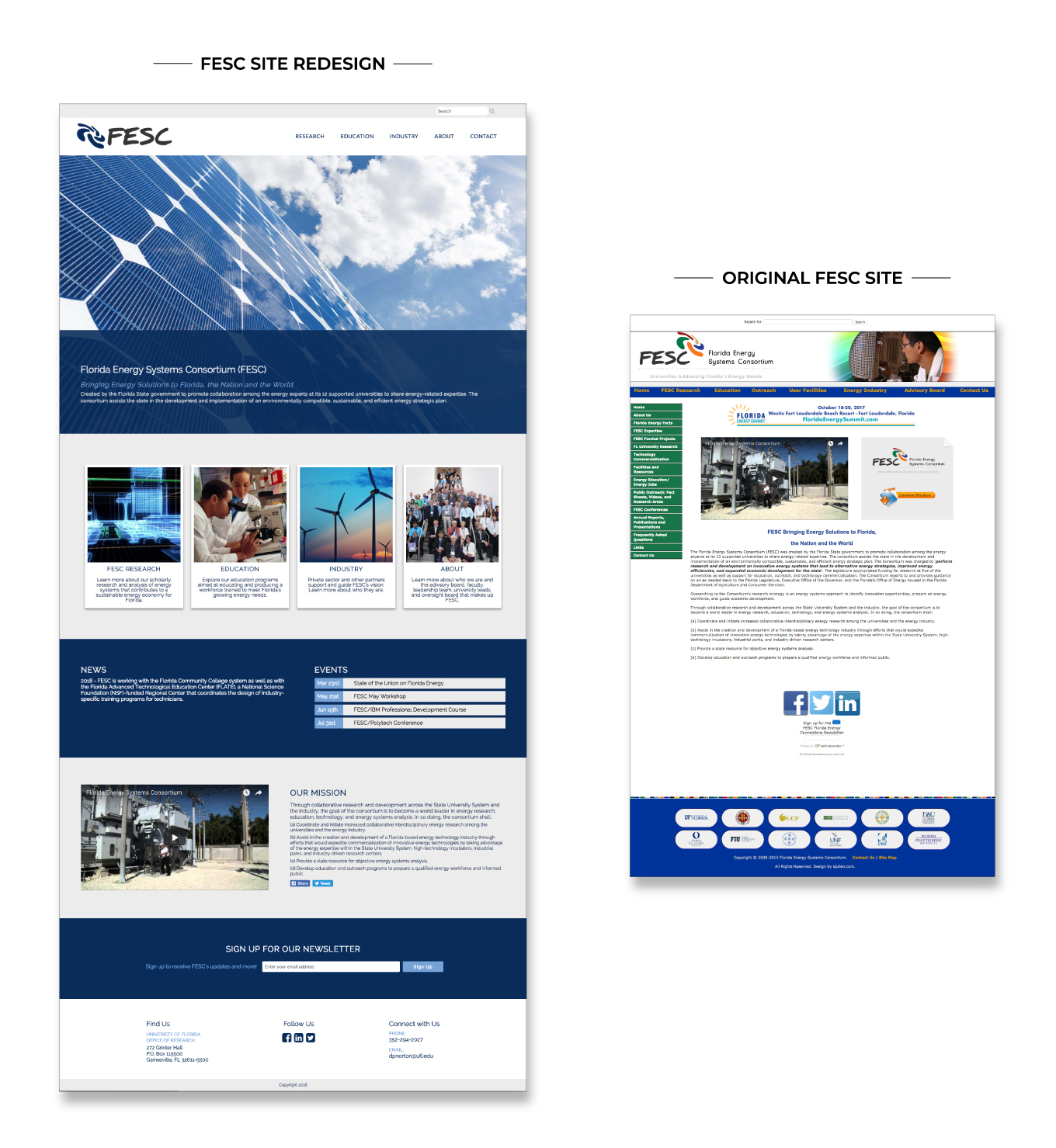
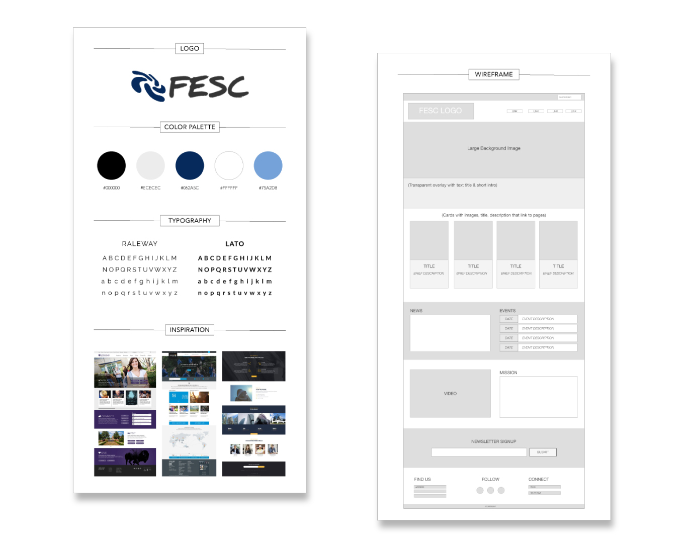
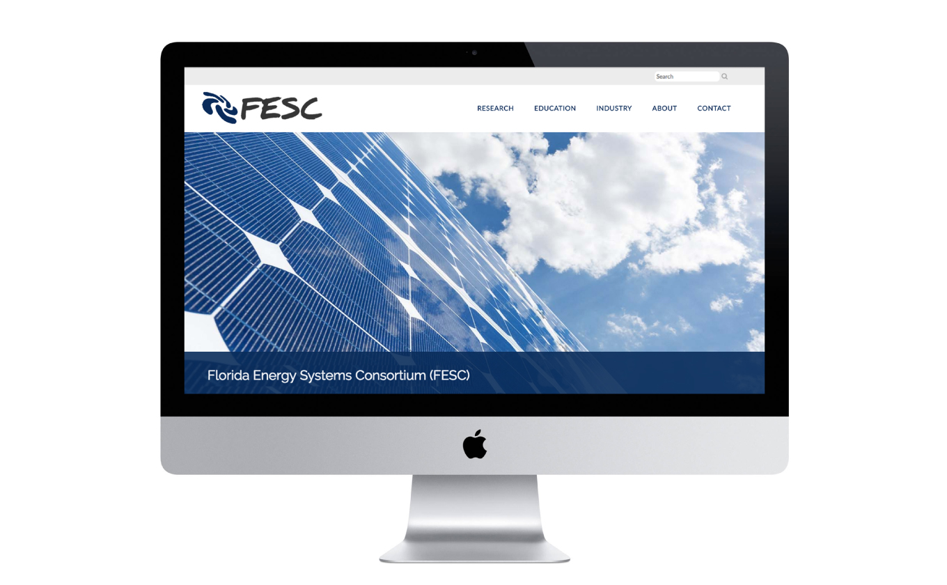
Clean Design
Since the current site was too busy and difficult to navigate as a result, I knew that I wanted a a minimal but impactful design theme. I set out to redesign the FESC logo and rebrand the site. The color scheme was initially pulled from the original FESC logo's dark blue color and paired with complimentary colors in soothing tones. Modern fonts were chosen as well.
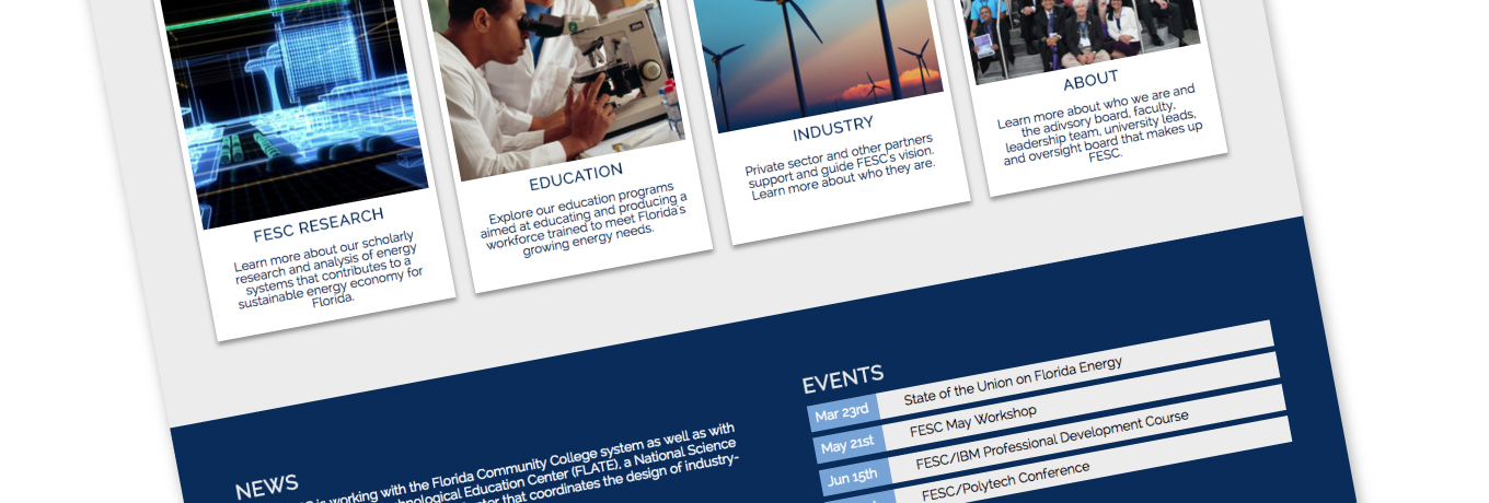
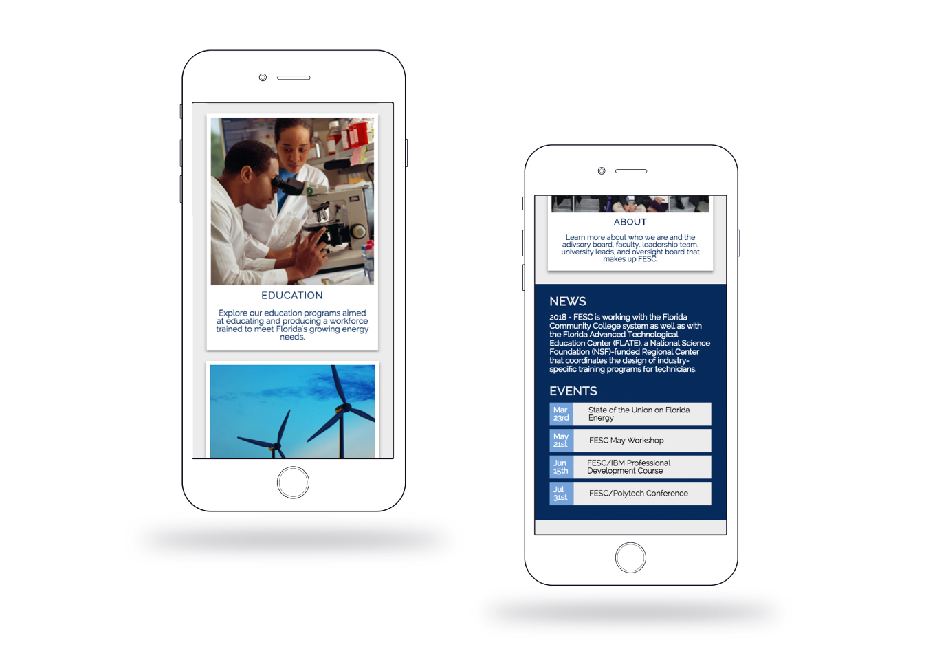
A Modular Approach
Since the current site was not mobile responsive in any way, I knew that I would have to design with a modular approach & flexible content in mind for mobile optimization. Upon designing the inital landing page interface, I then went through and designed each module in detail. The process was repeated for each internal page.
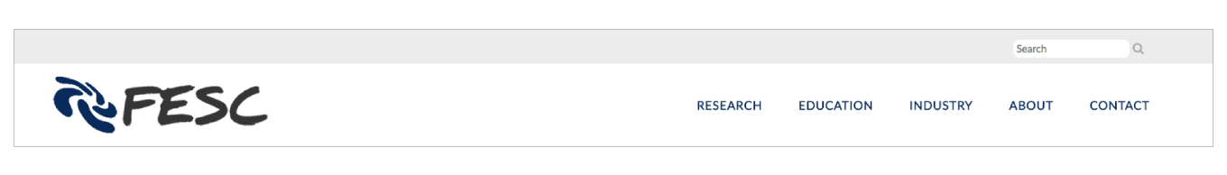
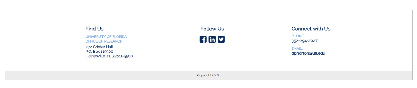
Easy Navigation, Hard Descisions
The design of navigation bar and footer was significantly overhauled to make navigation easier. I had to make major decisions on how to organize and condense all of the nav bar and side bar links without losing key information.
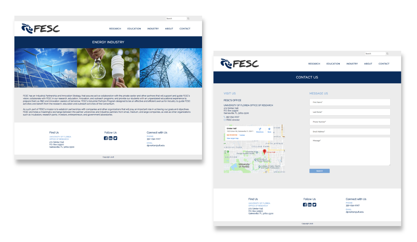
Consistency is Key
One of the key issues with the previous Florida Energy site is that each page layout changed drastically: a unifying layout was lacking. I designed all internal pages to have the same header and footer, with just the main section of each page changing content to ensure there was consistency and flow between the pages.
Development Features
The Florida Energy redesign is written in SASS. Vue.js was incorporated to populate a list of links for universities from an array in the Education page. Google Charts were also added to the Research page. Instead of using static data, the data populated is sourced from the US Energy Information Administration web API.
You can view the project's Github repository and live site.